🌸 How To Paint Cherry Blossoms
I remember the first time I tried to paint cherry blossoms. The delicate, fleeting beauty seemed incredibly challenging to capture on canvas. Through practice and experimentation, I discovered that this enchanting subject is more accessible than it appears.
This guide shares the techniques I’ve refined, offering you a clear path to creating your own beautiful cherry blossom artwork. You’ll gain practical skills and confidence, transforming a blank surface into a vibrant spring scene. Let’s make some art together.
Quick Overview
This guide will walk you through the process of painting beautiful, convincing cherry blossoms. You’ll learn how to build up delicate layers and create a sense of depth and realism. By the end, you’ll have a stunning piece of art and a deeper understanding of floral painting techniques.
- Time needed: 2-4 hours (depending on complexity and drying time)
- Difficulty: Beginner to Intermediate
- What you’ll need: Acrylic or watercolor paints, brushes, canvas/paper, water, palette, paper towels
Step-by-Step Instructions
Step 1: Gather Your Artistic Arsenal
Before dipping your brush, ensure you have all necessary supplies ready. A well-prepared workspace enhances your creative flow and prevents interruptions. This initial setup sets the stage for a smooth painting experience.
Collect your paints: white, various shades of pink (magenta, light pink, rose), brown, black, and a touch of yellow or green. These colors will bring your blossoms to life.
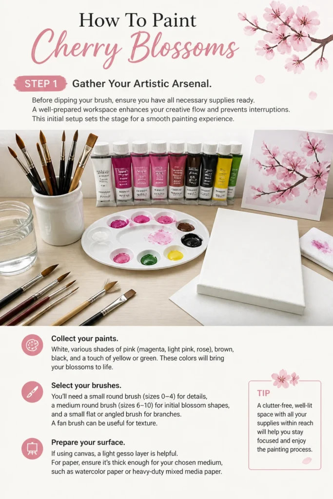
Select your brushes. You’ll need a small round brush (sizes 0-4) for details, a medium round brush (sizes 6-10) for initial blossom shapes, and a small flat or angled brush for branches. A fan brush can be useful for texture.
Prepare your surface. If using canvas, a light gesso layer is helpful. For paper, ensure it’s thick enough for your chosen medium, such as watercolor paper or heavy-duty mixed media paper.
Pro Tip: Keep a container of clean water and a roll of paper towels close by. Regular brush cleaning prevents muddy colors and keeps your bristles in top condition.
Step 2: Establish Your Background Wash
A soft, atmospheric background helps your cherry blossoms pop. This initial layer creates depth and sets the mood for your painting. Think of it as the gentle spring air behind your branches.
Mix a very diluted wash of light blue, pale gray, or a soft green. You want it barely visible, just a hint of color.
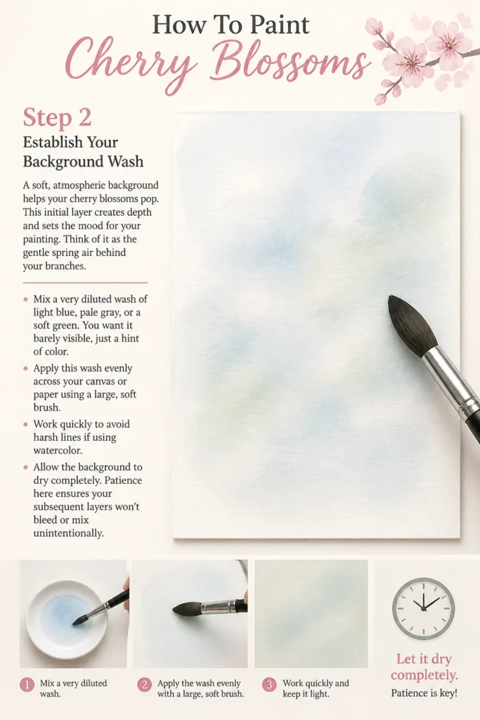
Apply this wash evenly across your canvas or paper using a large, soft brush. Work quickly to avoid harsh lines if using watercolor.
Allow the background to dry completely. Patience here ensures your subsequent layers won’t bleed or mix unintentionally.
Step 3: Sketch the Branch Structure
The branches provide the essential framework for your blossoms. They dictate the flow and composition of your artwork. A good branch structure creates a natural, organic feel.
Lightly sketch your main branch lines with a pencil or very diluted brown paint. Focus on creating an interesting, asymmetrical composition.
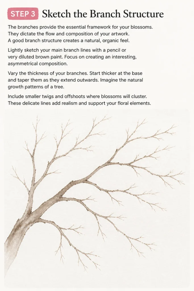
Vary the thickness of your branches. Start thicker at the base and taper them as they extend outwards. Imagine the natural growth patterns of a tree.
Include smaller twigs and offshoots where blossoms will cluster. These delicate lines add realism and support your floral elements.
Step 4: Paint the Core Branch Details
Bring your sketched branches to life with deeper, more defined tones. This step adds dimension and texture, making them feel like real wood. The branches are the backbone of your composition.
Mix a dark brown using brown and a tiny touch of black or deep blue. This creates a rich, natural shade.
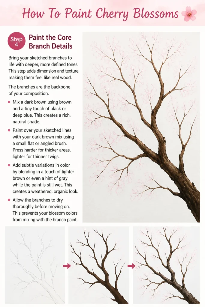
Paint over your sketched lines with your dark brown mix using a small flat or angled brush. Press harder for thicker areas, lighter for thinner twigs.
Add subtle variations in color by blending in a touch of lighter brown or even a hint of gray while the paint is still wet. This creates a weathered, organic look.
Allow the branches to dry thoroughly before moving on. This prevents your blossom colors from mixing with the branch paint.
Step 5: Lay Down Initial Blossom Shapes
Now for the exciting part: adding the first hints of blossoms. These initial shapes are the foundation upon which you’ll build your delicate flowers. Don’t aim for perfection yet.
Mix a medium pink using white and your chosen pink (e.g., rose pink). It should be opaque enough to show up against the branches.
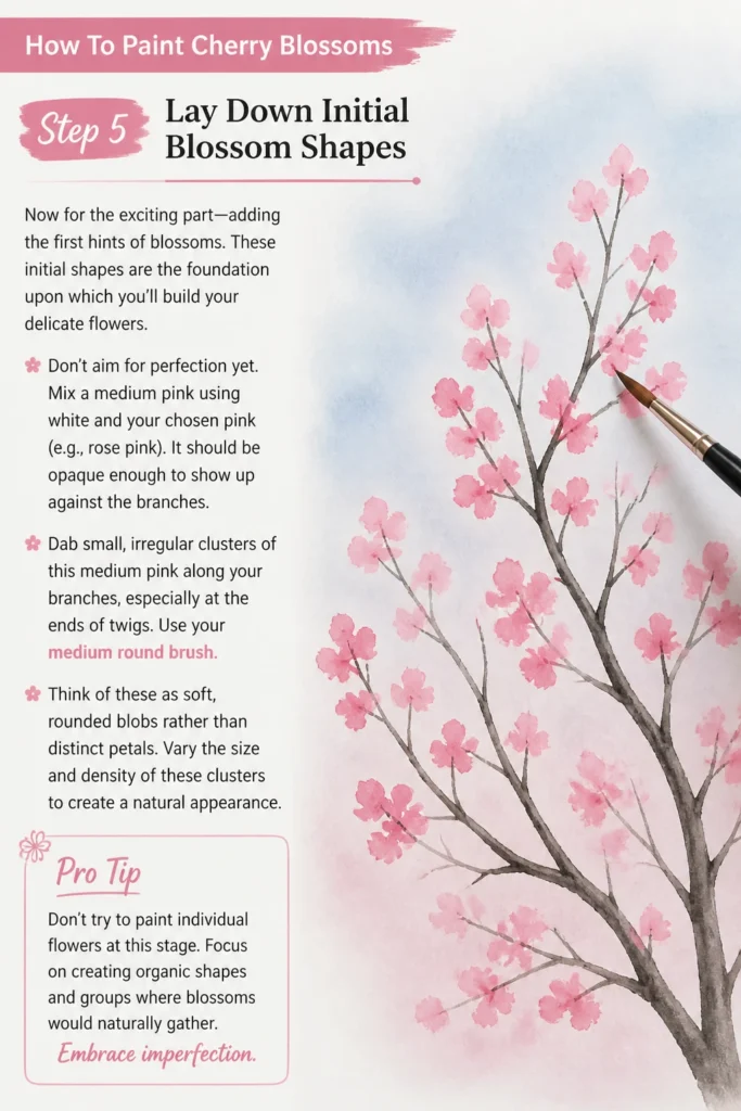
Dab small, irregular clusters of this medium pink along your branches, especially at the ends of twigs. Use your medium round brush.
Think of these as soft, rounded blobs rather than distinct petals. Vary the size and density of these clusters to create a natural appearance.
Pro Tip: Don’t try to paint individual flowers at this stage. Focus on creating organic shapes and groups where blossoms would naturally gather. Embrace imperfection.
Step 6: Build Up Blossom Volume and Depth
Layering different shades of pink will give your blossoms a beautiful, three-dimensional quality. This step adds richness and visual interest. It’s where the flowers truly begin to form.
Mix a slightly darker pink than your previous layer. Add a bit more of your pure pink or a touch of magenta to your mix.
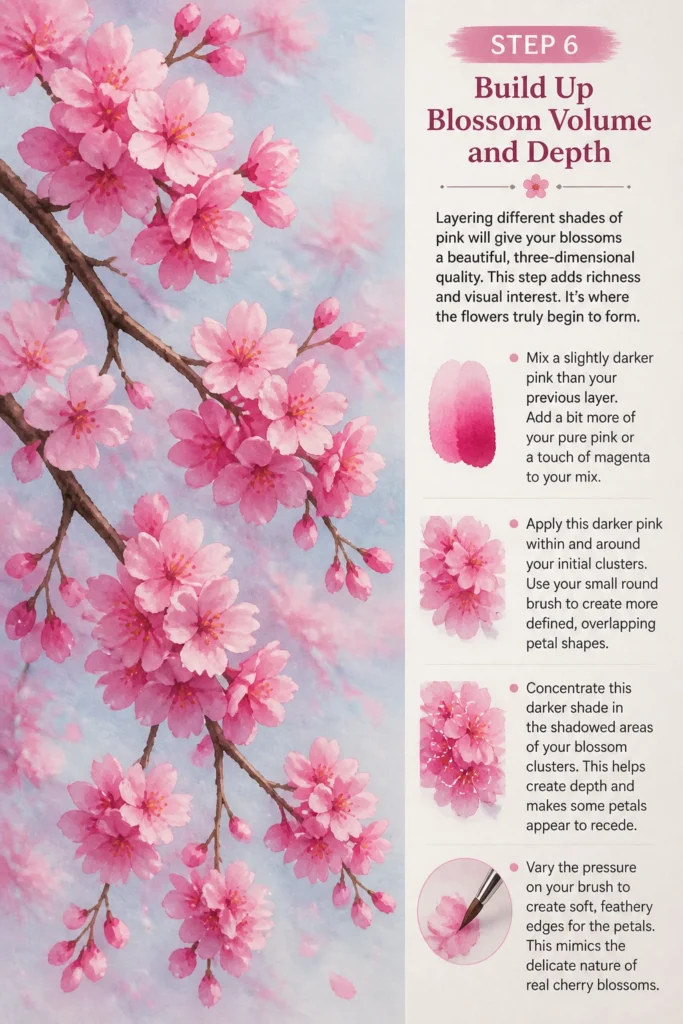
Apply this darker pink within and around your initial clusters. Use your small round brush to create more defined, overlapping petal shapes.
Concentrate this darker shade in the shadowed areas of your blossom clusters. This helps create depth and makes some petals appear to recede.
Vary the pressure on your brush to create soft, feathery edges for the petals. This mimics the delicate nature of real cherry blossoms.
Step 7: Add Highlights and Definition
Highlights are crucial for making your blossoms look vibrant and realistic. They catch the light and give the flowers their characteristic glow. This final layer brings them to life.
Mix a very light pink, almost white, by adding a lot of white to your palest pink. This will be your highlight color.
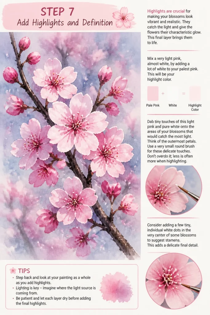
Dab tiny touches of this light pink and pure white onto the areas of your blossoms that would catch the most light. Think of the outermost petals.
Use a very small round brush for these delicate touches. Don’t overdo it; less is often more when highlighting.
Consider adding a few tiny, individual white dots in the very center of some blossoms to suggest stamens. This adds a delicate final detail.
Step 8: Refine and Add Final Touches
This is where you step back and assess your painting. Small adjustments can make a big difference, unifying the entire piece. Look for areas that need a little more love.
Revisit your branches. Add tiny, darker lines for texture or lighter lines for highlights if needed. Ensure they still feel like the foundation.
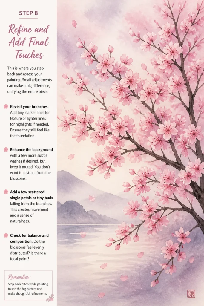
Enhance the background with a few more subtle washes if desired, but keep it muted. You don’t want to distract from the blossoms.
Add a few scattered, single petals or tiny buds falling from the branches. This creates movement and a sense of naturalness.
Check for balance and composition. Do the blossoms feel evenly distributed? Is there a focal point?
Common Mistakes to Avoid
Overworking Your Blossoms
Painting too many layers or constantly adjusting petals can lead to a muddy, overworked appearance. Cherry blossoms are delicate and airy. If you keep adding paint, they lose their freshness and become heavy. Instead, work in light, distinct layers, letting each dry before adding the next. Trust your initial dabs and resist the urge to perfect every single petal.
Using Muddy Colors
When pinks and browns mix unintentionally, your beautiful blossoms can turn dull. This often happens if brushes aren’t cleaned thoroughly between colors or if layers are applied before the previous one is dry. Always rinse your brushes thoroughly and use separate water containers for light and dark colors if you struggle with this. Ensure your paint layers are dry, especially when painting light colors over dark branches.
Creating Too Much Symmetry
Nature is rarely perfectly symmetrical, and cherry blossoms are no exception. If your branches are too uniform or your blossom clusters are identical, the painting can look stiff and unnatural. Introduce asymmetry in your branch structure, vary the size and density of your blossom clusters, and allow for organic imperfections. This creates a more dynamic and believable scene.
Lack of Depth
A flat painting lacks visual interest. Without varying tones and layers, your blossoms can look like simple cutouts. To avoid this, use a range of pinks from dark to light, layering them to create shadows and highlights. The darkest pinks recede, while the lightest pinks and whites come forward, giving your blossoms a beautiful three-dimensional quality.
Troubleshooting
My Blossoms Look Like Blobs
If your blossoms lack definition and appear as indistinct blobs, you might be using too much paint or an overly large brush for the details. Try using less paint on your brush and a smaller, pointed round brush for the petal layers. Focus on creating distinct, overlapping shapes rather than just dabbing color. Building up layers of slightly different pinks will also help define the forms.
The Branches Look Flat and Unrealistic
Flat branches usually mean you’ve used only one shade of brown. To add realism, incorporate variations in color and texture. Mix in darker browns with a touch of black for shadows and lighter browns or even a hint of gray for highlights and weathered areas. Use a fine brush to add tiny textural lines or knots, mimicking natural wood grain. Varying the thickness of the branches also adds to their realism.
Colors Are Bleeding Together
Color bleeding is a common issue, especially with acrylics or watercolors if layers aren’t dry. Ensure each layer of paint, especially the background and the initial branch colors, is completely dry before applying new colors. If working with watercolors, control the amount of water on your brush to prevent colors from spreading too much. With acrylics, a quick blast from a hairdryer can speed up drying time between layers.
Key Takeaways
- Layering is Key: Build your blossoms from darker to lighter pinks to achieve depth and realism.
- Vary Your Branches: Create an organic, asymmetrical structure with varying thickness and texture for natural appeal.
- Embrace Imperfection: Cherry blossoms are delicate and irregular; don’t strive for perfect symmetry.
- Control Your Paint: Use appropriate brush sizes and manage paint consistency to avoid muddy colors and blobs.
- Highlights Bring Life: A touch of pure white or very light pink makes your blossoms pop and appear vibrant.
- Patience Pays Off: Allow layers to dry thoroughly to prevent bleeding and ensure clean, crisp colors.
Frequently Asked Questions
What’s the best type of paint for cherry blossoms?
Both acrylics and watercolors work beautifully for cherry blossoms. Acrylics are forgiving, dry quickly, and allow for easy layering. Watercolors offer a soft, ethereal quality, perfect for their delicate nature, though they require more control over water. Choose the medium you are most comfortable with or wish to explore.
How do I make my cherry blossoms look natural and not stiff?
To achieve a natural look, focus on organic shapes and varied clusters. Avoid painting individual, perfectly formed flowers in neat rows. Let some blossoms overlap, scatter a few loose petals, and vary the sizes and densities of your flower groupings. Introduce asymmetry in your composition, just as you’d see in nature.
What colors should I mix for realistic pinks?
Start with a basic magenta or rose pink. You can lighten it with white for softer petals and highlights. For deeper, shadowed areas, add a touch of crimson or even a tiny speck of brown to your pink, but be careful not to make it muddy. Experiment on your palette to find the perfect range of shades.
How do I make the branches look textured and not just flat lines?
To create textured branches, don’t use just one flat color. Mix dark browns with hints of black for shadows and lighter browns or grays for highlights. Use a small, firm brush to create short, broken strokes that mimic bark. You can also add very thin lines of a darker color along one edge and a lighter color along the other to suggest roundness and depth.
Our Top Recommended Finds
- Artist’s Acrylic Paint Set: A good starter set with a range of pinks, browns, and white is essential for beginners. Look for one with decent pigment quality.
- Fine Detail Brush Set: Having a variety of small round and liner brushes (sizes 000-4) is crucial for those delicate petal edges and stamens.
- Heavyweight Mixed Media Paper: For practice or finished pieces, this paper can handle both acrylics and watercolors without buckling.
Embrace Your Inner Artist
You now have the tools and knowledge to create your own stunning cherry blossom painting. The beauty of art lies in the journey, not just the destination. Each brushstroke is a step towards expressing your unique vision.
Don’t be afraid to experiment with different shades of pink or unique branch formations. Perhaps try incorporating a subtle moon or a distant mountain. Pick up your brushes today and let the delicate beauty of cherry blossoms unfold on your canvas.