🎨 How To Make Golden Colour
Creating the perfect golden colour can transform your art, craft, or design project. It adds a touch of luxury, warmth, and vibrancy that’s truly captivating.
I remember my first attempt at a “golden” sunset; it ended up looking more like a muddy orange. Learning the nuances of mixing pigments made all the difference.
This guide will walk you through the precise steps to achieve that radiant, sought-after hue, ensuring your efforts yield stunning results every time.
Quick Overview
This guide will teach you how to mix various pigments to create a convincing and beautiful golden colour, suitable for many artistic applications.
- Time needed: 15-30 minutes (for initial mixing and experimentation)
- Difficulty: Beginner to Intermediate
- What you’ll need: Primary colour paints (yellow, red), brown paint, white/black paint (optional), mixing palette, brushes, and a surface to test on.
Step-by-Step Instructions
Step 1: Gather Your Essential Materials
Before you begin mixing, ensure you have all the necessary supplies readily available. A well-prepared workspace makes the process smoother and more enjoyable.
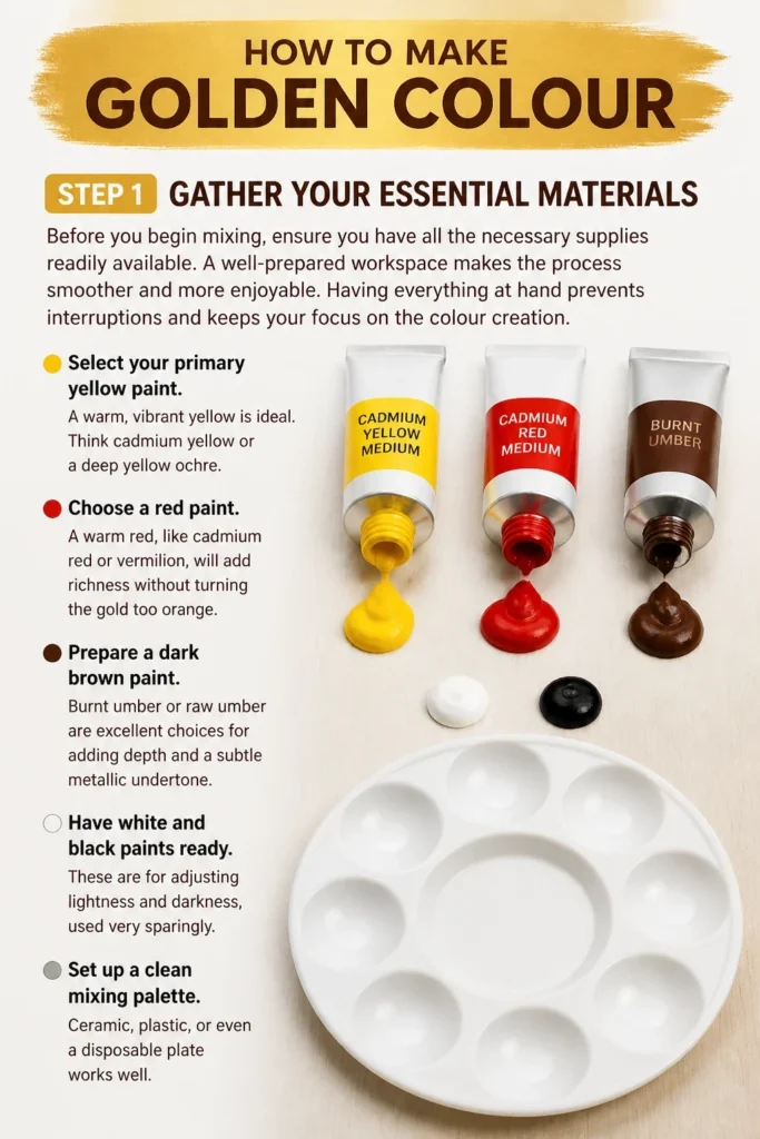
Having everything at hand prevents interruptions and keeps your focus on the colour creation.
- Select your primary yellow paint. A warm, vibrant yellow is ideal. Think cadmium yellow or a deep yellow ochre.
- Choose a red paint. A warm red, like cadmium red or vermilion, will add richness without turning the gold too orange.
- Prepare a dark brown paint. Burnt umber or raw umber are excellent choices for adding depth and a subtle metallic undertone.
- Have white and black paints ready. These are for adjusting lightness and darkness, used very sparingly.
- Set up a clean mixing palette. Ceramic, plastic, or even a disposable plate works well.
- Grab several clean brushes or palette knives for mixing and application.
- Prepare a test surface. Scrap paper, canvas, or wood will allow you to see your mixed colour accurately.
Pro Tip: Always start with a clean palette and fresh water if you’re using water-based paints. Contamination can easily alter your desired golden hue.
Step 2: Understand the Fundamentals of Golden Colour
Golden colour isn’t a single shade; it’s a spectrum of warm, rich tones. It’s essentially a sophisticated yellow, often with hints of orange, red, and brown.
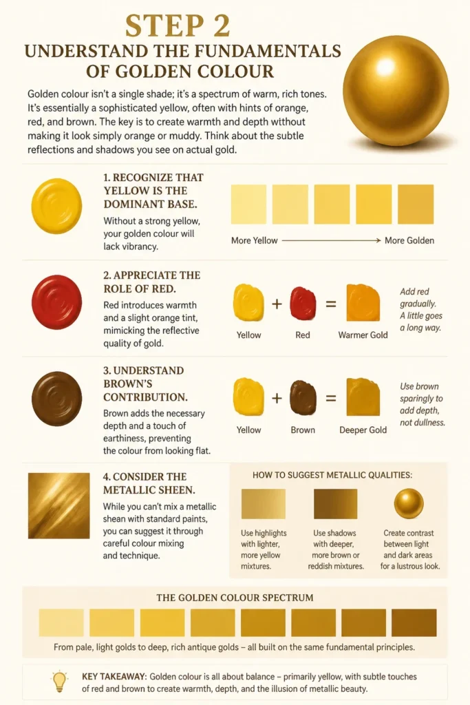
The key is to create warmth and depth without making it look simply orange or muddy. Think about the subtle reflections and shadows you see on actual gold.
- Recognize that yellow is the dominant base. Without a strong yellow, your golden colour will lack vibrancy.
- Appreciate the role of red. Red introduces warmth and a slight orange tint, mimicking the reflective quality of gold.
- Understand brown’s contribution. Brown adds the necessary depth and a touch of earthiness, preventing the colour from looking flat.
- Consider the metallic sheen. While you can’t mix a metallic sheen with standard paints, you can suggest it through careful colour blending and value shifts.
Step 3: Lay Down Your Base Yellow
Start with a generous amount of your chosen yellow paint on your mixing palette. This will be the foundation of your golden colour.
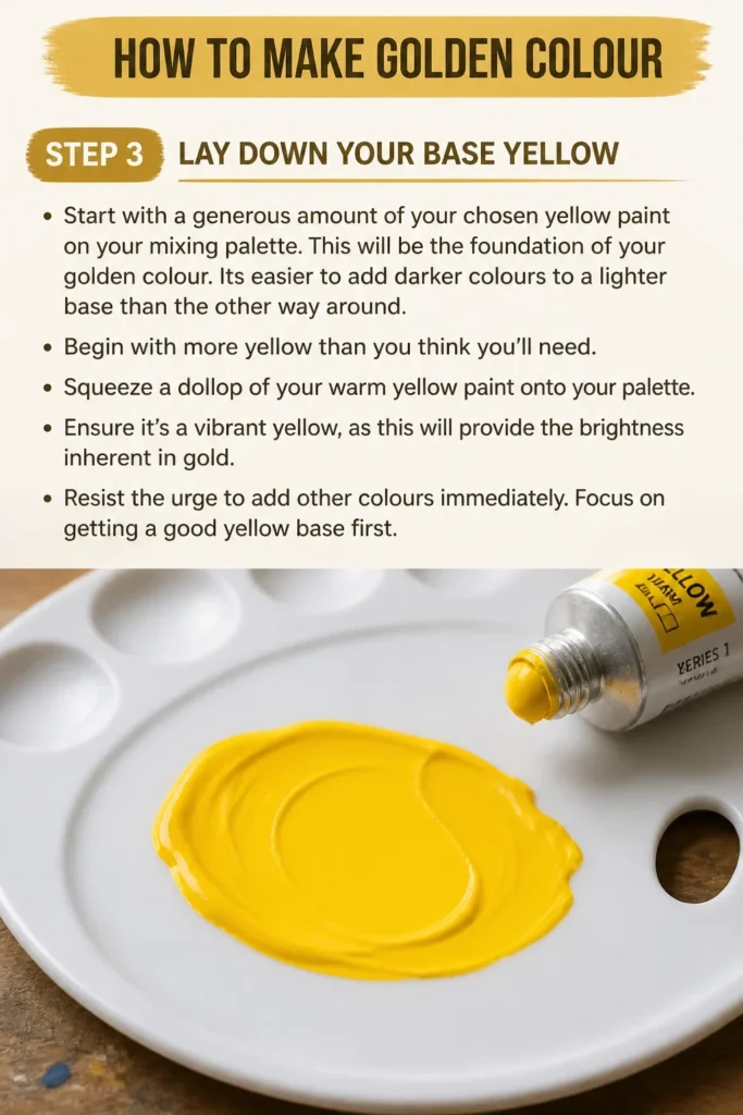
It’s easier to add darker colours to a lighter base than the other way around. Begin with more yellow than you think you’ll need.
- Squeeze a dollop of your warm yellow paint onto your palette.
- Ensure it’s a vibrant yellow, as this will provide the brightness inherent in gold.
- Resist the urge to add other colours immediately. Focus on getting a good yellow base first.
Step 4: Introduce Red for Warmth and Richness
Carefully add a very small amount of red paint to your yellow base. The goal is to warm up the yellow, not to turn it orange.
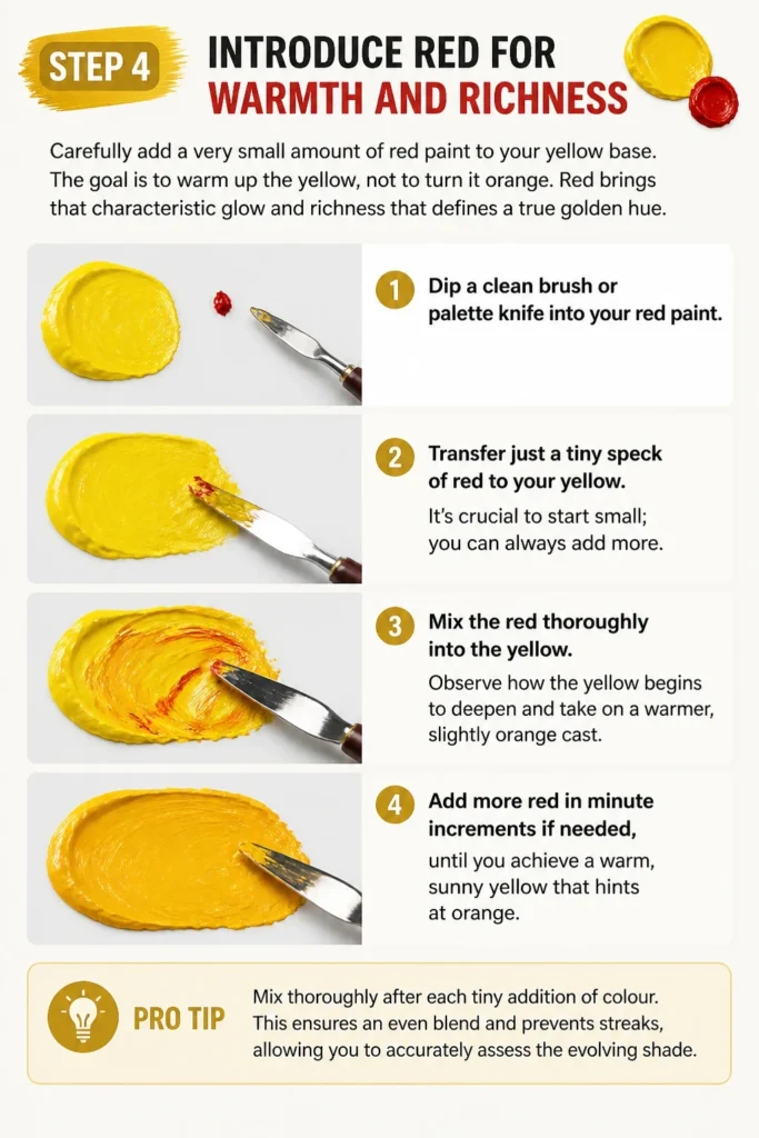
Red brings that characteristic glow and richness that defines a true golden hue.
- Dip a clean brush or palette knife into your red paint.
- Transfer just a tiny speck of red to your yellow. It’s crucial to start small; you can always add more.
- Mix the red thoroughly into the yellow. Observe how the yellow begins to deepen and take on a warmer, slightly orange cast.
- Add more red in minute increments if needed, until you achieve a warm, sunny yellow that hints at orange.
Pro Tip: Mix thoroughly after each tiny addition of colour. This ensures an even blend and prevents streaks, allowing you to accurately assess the evolving shade.
Step 5: Add Brown for Depth and Earthiness
Now, introduce a tiny amount of brown paint to your yellow-red mixture. This step is critical for giving your golden colour depth and a more authentic, less cartoonish appearance.
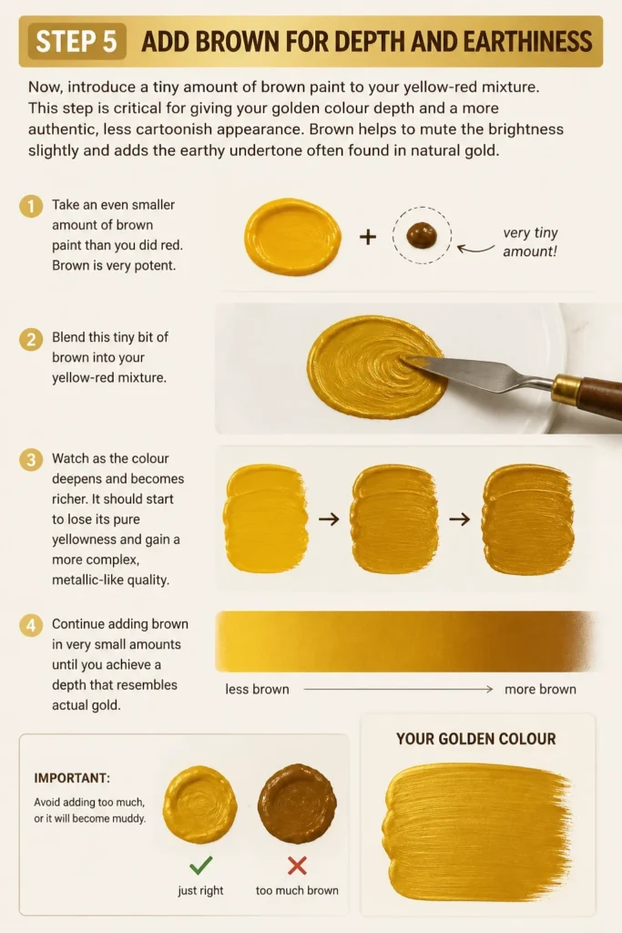
Brown helps to mute the brightness slightly and adds the earthy undertone often found in natural gold.
- Take an even smaller amount of brown paint than you did red. Brown is very potent.
- Blend this tiny bit of brown into your yellow-red mixture.
- Watch as the colour deepens and becomes richer. It should start to lose its pure yellowness and gain a more complex, metallic-like quality.
- Continue adding brown in very small amounts until you achieve a depth that resembles actual gold. Avoid adding too much, or it will become muddy.
Step 6: Adjust Lightness and Darkness (Value)
Once you have a good base golden hue, you might want to adjust its lightness or darkness. This is where white and black paints come in, but use them with extreme caution.
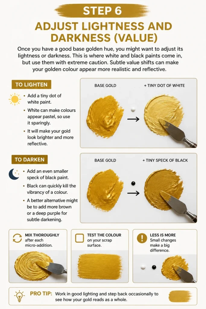
Subtle value shifts can make your golden colour appear more realistic and reflective.
- To lighten: Add a tiny dot of white paint. White can make colours appear pastel, so use it sparingly. It will make your gold look brighter and more reflective.
- To darken: Add an even smaller speck of black paint. Black can quickly kill the vibrancy of a colour. A better alternative might be to add more brown or a deep purple for subtle darkening.
- Mix thoroughly after each micro-addition. Test the colour on your scrap surface.
Step 7: Test and Refine Your Golden Colour
The only way to truly know if your golden colour is right is to test it. Apply a swatch to your designated test surface and let it dry if necessary.
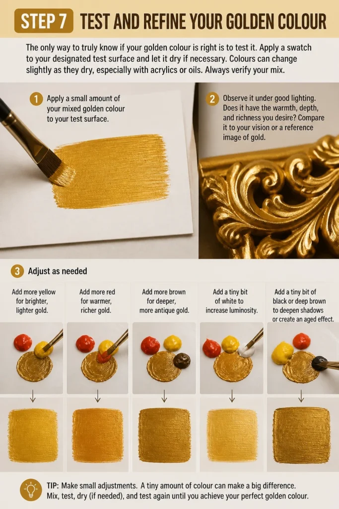
Colours can change slightly as they dry, especially with acrylics or oils. Always verify your mix.
- Apply a small amount of your mixed golden colour to your test surface.
- Observe it under good lighting. Does it have the warmth, depth, and richness you desire?
- Compare it to your vision or a reference image of gold.
- Adjust as needed:
- Add more yellow for brighter, lighter gold.
- Add more red for warmer, richer gold.
- Add more brown for deeper, more antique gold.
- Add a tiny bit of white to increase luminosity.
- Add a tiny bit of black or deep brown to deepen shadows or create an aged effect.
Step 8: Experiment with Variations for Different Golds
Once you master the basic golden mix, you can explore variations. Gold isn’t just one colour; it ranges from bright, shiny yellow-gold to deep, antique bronze-gold.
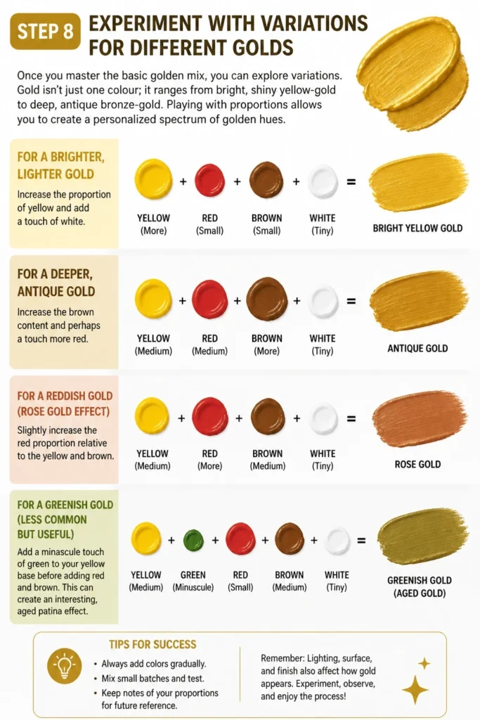
Playing with proportions allows you to create a personalized spectrum of golden hues.
- For a brighter, lighter gold: Increase the proportion of yellow and add a touch of white.
- For a deeper, antique gold: Increase the brown content and perhaps a touch more red.
- For a reddish gold (rose gold effect): Slightly increase the red proportion relative to the yellow and brown.
- For a greenish gold (less common but useful): Add a minuscule touch of green to your yellow base before adding red and brown. This can create an interesting, aged patina effect.
Common Mistakes to Avoid
Adding Too Much Dark Colour Too Soon
One of the most common pitfalls is adding too much brown or black paint early in the mixing process. These colours are very strong and can quickly overpower your vibrant yellow base.
If you add too much dark colour, your golden mix will turn muddy or dull, losing its inherent luminosity. Always start with tiny amounts and build up gradually.
Using a Cool Yellow or Red Base
Starting with a cool yellow (like lemon yellow) or a cool red (like crimson) will make it much harder to achieve a warm, vibrant golden colour. These cool tones will pull your mix towards green or purple undertones.
Always opt for warm yellows (cadmium yellow, yellow ochre) and warm reds (cadmium red, vermilion) to ensure your gold has that characteristic glow.
Not Testing Your Mix Properly
Mixing paint on a palette often looks different when applied to a surface, especially once dry. If you skip the testing phase, you might find your “perfect” gold looks off on your final piece.
Always swatch your mixed colour on a scrap piece of the same material you’ll be using for your main project. Let it dry completely to see its true colour.
Mixing Too Much at Once
While it’s good to start with a decent amount of yellow, trying to mix a very large batch of gold at once can lead to inconsistencies. It’s harder to gauge small additions across a large volume of paint.
Mix in manageable quantities. If you need a lot of gold, mix smaller batches and try to replicate your successful ratios, or dedicate more time to careful, larger-scale mixing.
Troubleshooting
My Gold Looks Too Orange
If your mixed golden colour appears too orange, it means you’ve added too much red relative to your yellow and brown. The red has become dominant, shifting the hue away from gold.
To fix this, add more yellow paint to the mixture. A tiny bit of brown can also help to deepen and mute the orange slightly, bringing it back towards a golden hue.
My Gold Looks Muddy or Dull
A muddy or dull golden colour typically results from adding too much brown or black paint, or from using a dirty brush/palette. The depth has overwhelmed the vibrancy.
Try adding more pure yellow to brighten and lift the colour. If it’s very muddy, you might need to start a fresh batch, being much more conservative with your dark colours.
My Gold Isn’t Luminous Enough
If your gold lacks that characteristic glow and appears flat, it might be missing enough vibrant yellow or is too heavily weighted with brown. Sometimes, cool undertones can also reduce luminosity.
Increase the amount of your warm yellow paint. A very tiny touch of white can also boost perceived luminosity, making the colour feel brighter and more reflective.
Key Takeaways
- Golden colour is primarily a warm yellow base, enhanced with red and brown.
- Always start with a generous amount of warm yellow paint.
- Add red and brown paints in tiny, controlled increments to build depth and warmth.
- Mix thoroughly after each addition to accurately assess the colour’s evolution.
- Test your mixed colour on a scrap surface to see its true appearance, especially when dry.
- Adjust lightness with white and darkness with more brown or a tiny bit of black, using extreme caution.
- Experiment with ratios to create different shades of gold, from bright to antique.
Frequently Asked Questions
Can I make metallic gold paint from scratch?
You cannot create a true metallic sheen by simply mixing standard pigments. Metallic paints contain tiny reflective particles (like mica or actual metal flakes) that give them their shimmer. What you can achieve with mixing is a colour that looks like gold, or a base colour to which you can add metallic powders or glitters.
What if I only have primary colours (red, yellow, blue)?
You can still make a golden colour! You’ll first need to mix orange from red and yellow. Then, add a tiny bit of blue to your orange. Blue is the complementary colour to orange, and a very small amount will create a desaturated, brownish tone, giving you a ‘brown’ to mix with your yellow and orange for gold. This requires even more careful control.
Does the type of paint matter (acrylic, oil, watercolour)?
Yes, the type of paint can affect the final appearance and mixing process. Acrylics dry quickly and often darken slightly. Oils dry slowly and retain their wet colour. Watercolours are transparent and rely on layering. The principles of colour mixing remain the same, but you’ll need to adapt your technique to the specific medium’s properties.
How do I create a shiny or reflective gold effect without metallic paint?
Achieving a shiny effect without metallic paint is about illusion. You can use strong contrasts in value (lightest lights next to darkest darks) and sharp edges to suggest reflection. Highlighting with a very pale, bright yellow-white and shading with deep browns can trick the eye into seeing a metallic quality. A glossy varnish can also enhance the effect.
Our Top Recommended Finds
- Artist’s Mixing Palette: A ceramic or large plastic palette provides ample space for mixing colours without cross-contamination. Its smooth surface makes cleanup easy.
- Quality Paint Brush Set: A good set of brushes in various sizes allows for precise mixing and application. Look for brushes that hold their shape well.
- Colour Theory Wheel: A physical colour wheel can be an invaluable tool for understanding colour relationships and how to create specific hues, including your golden variations.
Embrace the Radiance of Your Creation
You now possess the knowledge and practical steps to craft beautiful golden colours. This skill is more than just mixing paints; it’s about understanding how colours interact and how to bring your artistic vision to life.
Don’t be afraid to experiment. Each project might call for a slightly different shade of gold, and your personal touch will make it unique.
Take these techniques and apply them to your next masterpiece. The world is waiting for your golden touch!